Hive: Crafting a Visual Identity for Luxury Aviation Excellence
Project: Visual Identity & Brand Identity
Brand Case Introduction – Hive Aviation Redefining Luxury in the Sky
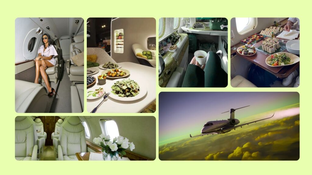
Hive isn’t in the business of transport. It operates in a category far above it—private aviation for the uncompromising. Their clients don’t just book flights; they demand discretion, precision, and a seamless experience engineered to perfection. Every interaction must signal trust. Every detail must reflect control. No room for noise, no tolerance for error.
When Hive approached me, the mission was clear: build a brand identity as refined and deliberate as the service itself. This wasn’t about decoration. It was about designing trust at first glance—visuals that speak the language of power, elegance, and elite-level clarity.
The goal: craft a visual system that aligns with Hive’s core values—discipline, discretion, and flawless execution—while positioning them as the definitive choice for private aviation among high-net-worth individuals and global decision-makers.
This is not a luxury trend. This is luxury as standard.
This is Hive.
Challenge: Crafting a Brand Identity Aligned with Elite Standards
Hive operates in a market where perception is power. Their audience isn’t looking for noise—they expect clarity, confidence, and absolute trust. The problem? Hive’s existing identity lacked strategic cohesion. Visually inconsistent and conceptually vague, it failed to reflect the premium standards of private aviation.
This wasn’t just a design issue—it was a credibility gap.
The objective was clear: develop a brand identity that doesn’t just look high-end but feels institutional. Minimal yet unmistakably elite. Clean but commanding. Every element needed to reflect precision, discretion, and authority—the very qualities their clientele demand.
This wasn’t about aesthetics. It was about engineering trust at first glance.
Strategy: Precision and Elegance in Every Detail
This identity wasn’t built to look good. It was built to perform—quietly, powerfully, and with intent. Every design decision was driven by one goal: translate Hive’s core values into a visual language of precision, discretion, and understated luxury.
The logo? Clean, deliberate, and sharp. No noise. Just a form that speaks.
The color palette? Restrained but rich—cool neutrals with a controlled warmth that signals trust and subtle elegance.
Typography? Purposeful. Functional at its core, refined in its delivery.
Nothing here is decorative. Every element reinforces Hive’s position as a brand that values clarity over chaos and execution over excess. From digital to print, every touchpoint was aligned to reflect seamless service, quiet authority, and high-end minimalism. This isn’t designed for attention—it’s designed for impact.
Execution: Strategic Visual System Built for Impact
The final identity system is built on clarity, confidence, and control. At its core: a bold, unmistakable logo mark engineered for instant recognition. It’s paired with a restrained, modern typeface—purposefully selected to bring balance, structure, and authority to every application.
The colour strategy is deliberate. Dominant Black people signal strength and discipline. Warm golds add depth and distinction without screaming for attention. Neutral greys anchor the system—ensuring adaptability across formats without diluting presence.
Every element is intentional. This visual language is not just aesthetic—it’s operational. From digital interfaces to printed collateral, pitch decks to packaging, the system delivers brand consistency at every client touchpoint. No weak links. No visual noise. Just a sharp, strategic identity built to scale and last.

Results: Strengthening Hive’s Position in Luxury Aviation
Hive’s refined brand identity has delivered measurable impact—sharpening perception, increasing client trust, and reinforcing market position. The rebrand wasn’t cosmetic—it was strategic. Every element was designed to communicate clarity, control, and high-stakes reliability.
Since launch, Hive has seen a distinct rise in engagement from high-net-worth individuals and enterprise clients seeking discreet, elite travel solutions. The updated identity now aligns tightly with the expectations of the luxury market: clean execution, disciplined aesthetics, and an unmistakable signal of trust.
More than a visual upgrade, this identity system now serves as a strategic asset—built to support scalable growth without compromising Hive’s reputation for privacy, precision, and exclusivity. It’s not just branding—it’s positioning, executed with intent.
Conclusion: The Power of Intentional Design
Hive’s project is a reminder that true luxury is experienced in the details. The visual identity I crafted goes beyond aesthetics—it serves as a strategic asset that embodies Hive’s commitment to excellence. By stripping away noise and focusing on clarity, precision, and trust, Hive now stands ready to lead in the competitive world of private aviation with a brand as elevated as its service.